Payworks
Human Resources
Timeline
2017–2018
As part of this initiative, I recognized the need to establish a comprehensive design system that would ensure consistency in the customer experience and be accessible to incoming designers and developers. During the planning of the new HR module, I identified several key issues in the existing solution that contributed to a poor user experience:
- The outdated design featured a cluttered UI with an excessive use of buttons and tables, lacking modern styling. While existing clients were accustomed to it, new clients desired a more modern HR solution.
- Over time, new fields were added haphazardly, resulting in an illogical flow where clients struggled to find necessary information.
- Behind the scenes, developers had created multiple versions of the same object and designed variants independently, resulting in an inconsistent and confusing user experience.
- Multiple buttons serving the same purpose were scattered across a single page, leading to confusion. For example, one page featured three separate save buttons.
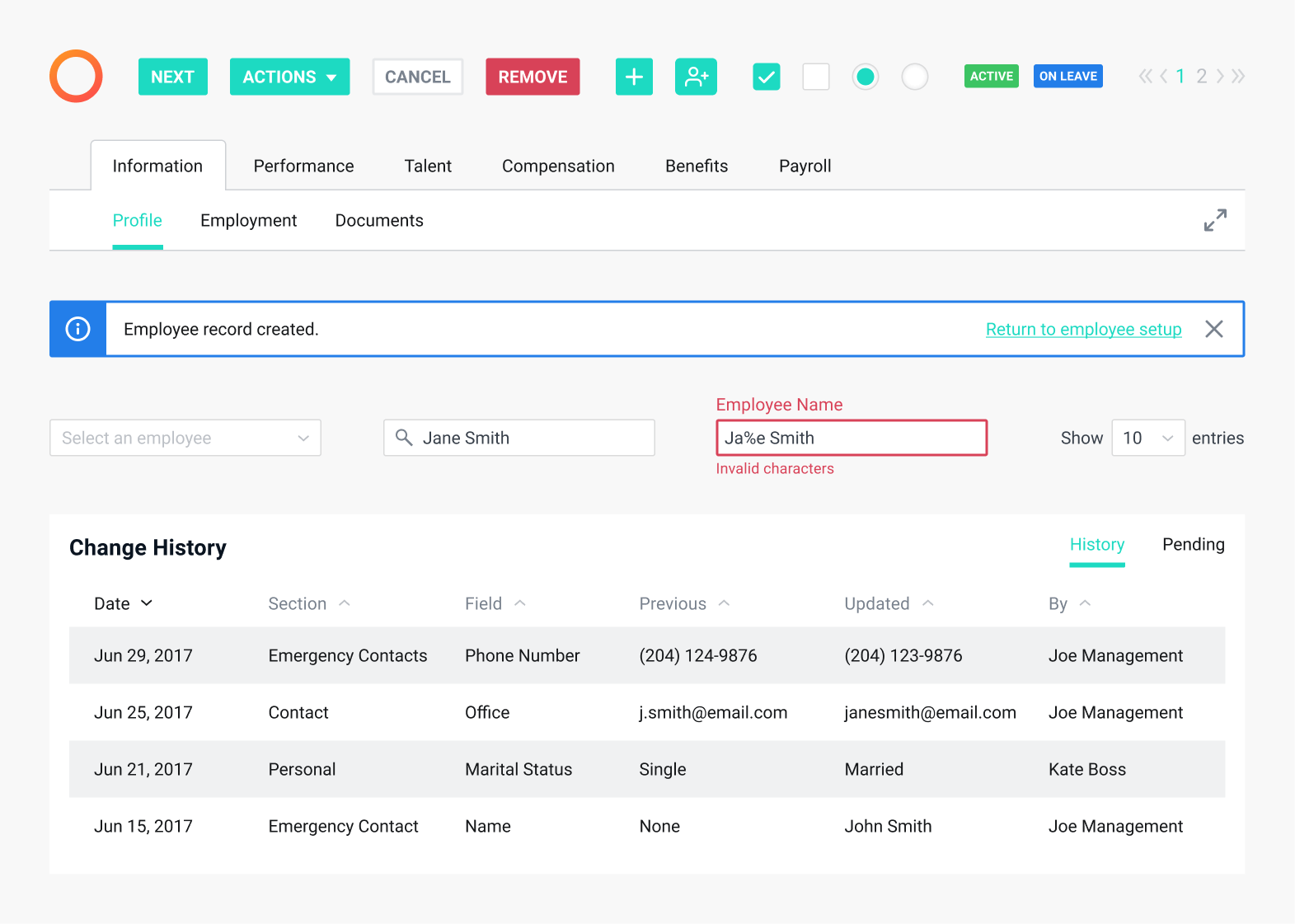
Sample of Payworks UI (2017)
In developing the HR design system, which would later be applied to the entire application, I drew inspiration from our marketing website and advertising materials. These sources featured fresh and engaging colours that aligned with our brand voice. To address the previous design’s issues of feeling cramped and overwhelming, our aim was to embrace whitespace, reduce cognitive load, and simplify navigation.
- This approach materialized in the HR module with a dedicated section for essential employee information, including their name, status, and employee number for quick identification.
- Employee data was reorganized and segmented by tabs to enhance navigation and provide flexibility for future updates.
- In contrast to the previous design where information pages were always editable, the new version introduced distinct viewing and editing states to prevent accidental changes.
- To manage page length effectively, we restructured and placed information into collapsible sections.
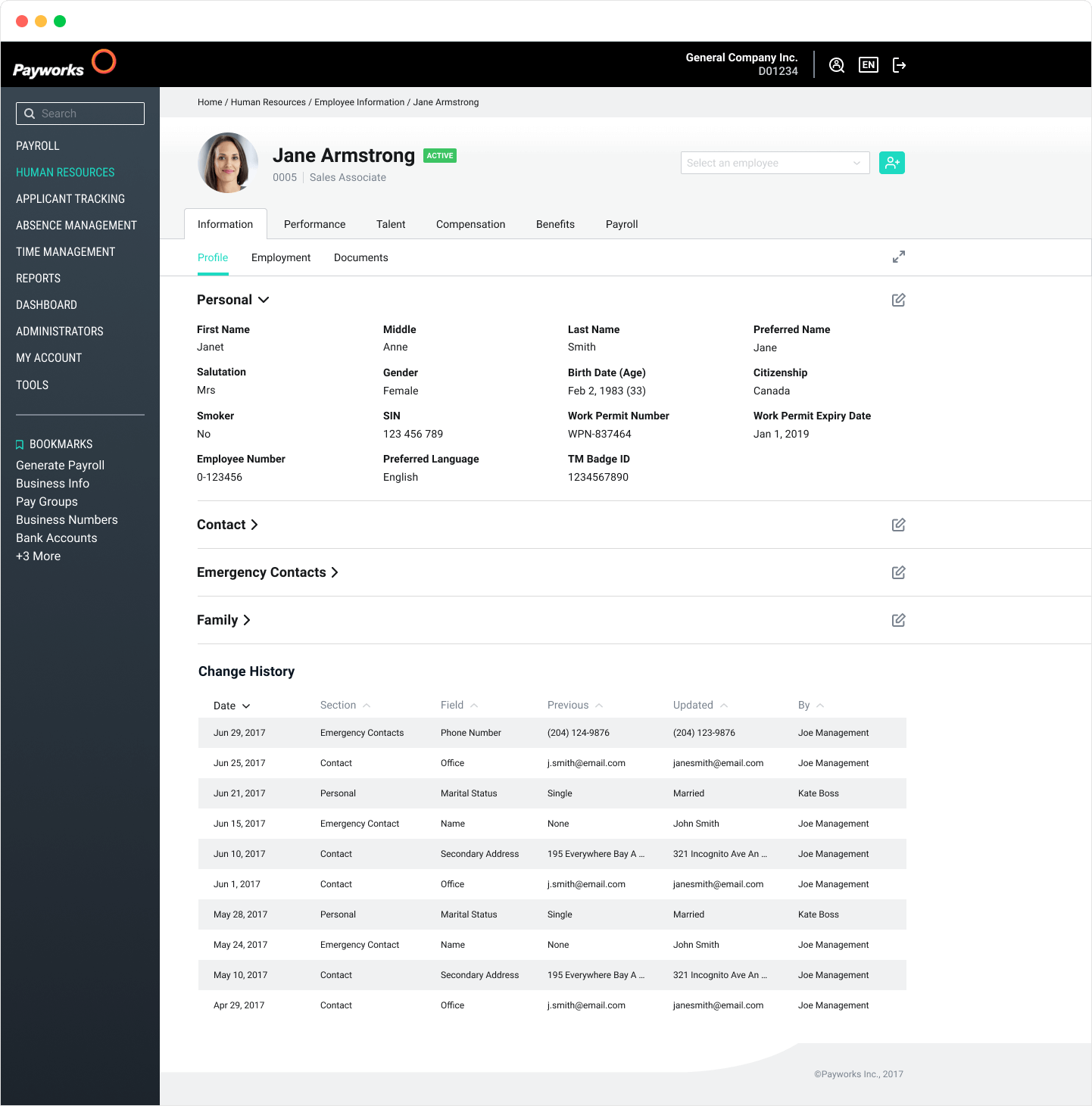
High fidelity version of the HR module (2018)
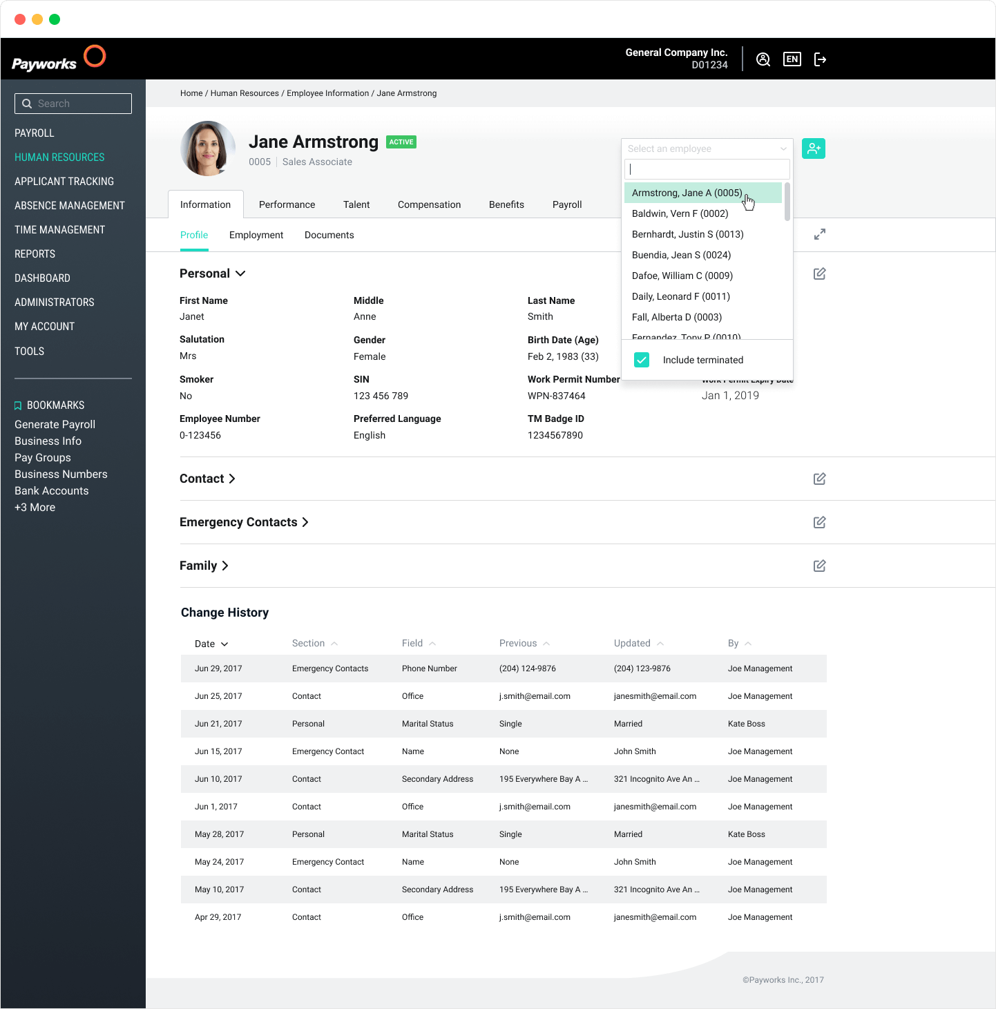
Navigating through the employee list (2018)
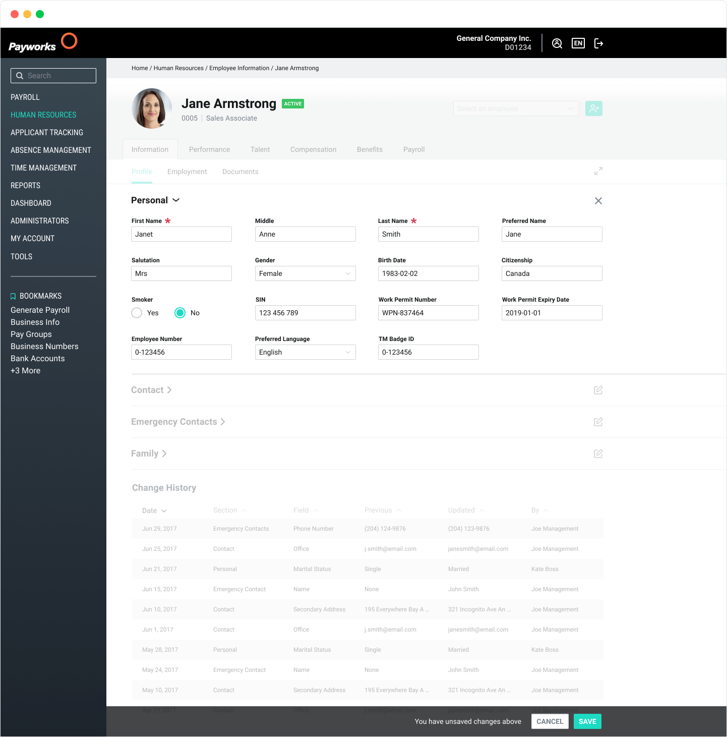
Editing an employee's information (2018)
Results
In the initial phase of our new HR experience launch, we experienced a temporary uptick in support calls from some long-time clients who found the changes initially jarring. However, the vast majority of users quickly adapted to the new design.
Sales for the HR module showed a notable increase, with our team reporting that demos to potential clients became significantly easier. Newly onboarded clients responded positively to the HR module, reflecting its improved user experience.